Summary.
In this guide, you’ll learn how consultants design slides in their business presentations.
Slide writing is the process of efficiently turning a narrative (storyline) into a visual compelling presentation. If you don’t master storylining yet, have a look first at our guide : How to outline a presentation: the consulting storylining method.
Slide writing skills are essential to master to build powerful business presentation (see our article on the topic). However, slides are rarely well-designed, because the slide writing methodology is not properly taught.
You can dramatically improve the way you build presentations in four simple steps (this article explains in details all the concepts below):
- Build your presentation skeleton
- Optional: setup the Slide Master, use slide libraries
- Add the executive summary, built from your storyline.
- Build the storyboard: blank content slides with titles mirroring the executive summary.
- Add structure slides (agenda, dividers, etc.).
- Build slide bodies
- Choose relevant visual elements (text, charts, diagrams).
- Focus on what matters (one message, streamlined wording, grouping).
- Show the way (contrast, navigator).
- Be rigorous and precise (spelling, numbers, legends, footnotes).
- Make it look good (white space, alignments, orphan words, font size).
- Check consistency in design throughout your presentation
- Iterate and refine your slides
- Ask for feedback.
- Leave your slide alone and come back to it.
You want to make sure you did not forget any step? Check that your slides are well-designed with the inslidr checklist.
Introduction.
Every day, professionals create millions of slides. In most organizations, communication revolves around presentations, which are collections of slides created with tools like PowerPoint, Google Slides, or Keynote.
Slide writing is the process of efficiently turning a narrative into a visual compelling presentation of slides. It encompasses everything from workflows and presentation structuring to design choices that guide your audience’s attention.
The consulting slide writing methodology is extremely powerful. Well-designed slides help engage and persuade your audience. Read our article on the topic if you want to learn more on the value of a well-thought layout.
Most professionals struggle with slide design, but the solution is simpler than you think. Whether you’re a student, executive, academic, consultant, or entrepreneur, this guide will show you how top strategy consultants create slides that stand out. slides. Our repeatable framework is a structured approach based on four essential steps that I will detail in this article: (1) Draft a skeleton (2) Build slide bodies (3) Check consistency (4) Iterate.

1. Draft a presentation skeleton
Optional: setup the Slide Master, use a slides template.
Integrate in the Slide Master the elements which will remain present on each slide of the presentation.
The Slide Master (or Theme Builder in Google Slides) allows you to customize fonts, footers, logo placement, and other design elements consistently across your presentation. Think of it as the foundation layer of your slides.
Every slide you create will then have the same font, logo placement, footer, header, and more. While setting this up requires a small initial investment, it pays off in the long run, you will not need to add logos etc. on each slide.
Build individual slide layouts.
Apply common elements to a selected set of slides.
In the Slide Master, you can add elements for every slide, but also create individual layouts so that you can integrate certain elements on all slides under a certain layout, but not for slides following a different pre-set layout.
For example, if you find it helpful, you can design executive summary slides, thank you slides, divider slides, two-, three-, or four-column slides, slides split in half, and more. Your creativity is the only limit here.
Create at least a Title only and a Title and body slide layout.
The only recommendation I would give here is to make sure you have at least a Title only and a Title and body slide type. This way, even if you integrate slides from other presentations, you can always switch them to Title only, and the branding applied in the Slide Master will remain consistent. Just make sure that you apply destination formatting when pasting the slide.
The Title and body slide layout is useful in can you wan’t to include text in the body. In Google slides at least, it’s better to use the text placeholder of the Title and body layout rather than inserting a text box. It’s the only way to make sure the text is consistent with the formatting in the Slide Master.
Keep your individual slide layouts simple.
I personally have a few slide presets that I have saved in the slide master. I typically add a title placeholder, as well as placeholders for footnotes, sources, presentation name, date and slide number. However, I almost never add any column, row or image placeholders. I focus on having designs which help divide the slides in mostly two blocks (slides split in third, half, etc., with color distinctions between the slide parts). That way, I can easily
- break monotony and include some variation in the slide designs
- change the slide division depending on the content I want to show, some information fit better a square format while others are well adapted to 16:9.
Once your slide types are set up, you can usually (at least in Google Slides and in the online version of PowerPoint) simply right-click on a slide preview to instantly apply a pre-designed layout. In the desktop PowerPoint app, you’ll need to click on the Layout button in the Home section of the toolbar.

Use slides libraries.
Regardless of whether you decide to create different slide layouts directly in the slide master of if you prefer to have a very simple slide master, you should take the habit of saving your best slides in another document.
Ideally, they should share a common theme (the colors and fonts which make your company brand identity) and slide master. You then simply need to copy and paste the layout you need in your new presentation.
inslidr tip – invest in pre-made slides libraries
If you want to save time but lack impactful slides to reuse, consider investing in a professionally designed, pre-made slides library.
This is an excellent option if you’re unsure where to start or want to ensure a polished look easily. While high-quality templates aren’t free, they’re a worthwhile investment that can save you hours of design work and help you create impactful presentations quickly.
They typically contain overall slide layout designs, but also some visual elements for the slide bodies, which we will tackle in the step 2.
The toolkit, our own slide library offers 100+ slide layouts built on proven consulting best practices, ready to drop into your decks.
Get the toolkit
Add the executive summary, built from your storyline.
Make the storyline the cornerstone of your presentation.
When one needs to build a presentation, the first step is usually to gather some existing slides on the topic, to think about how they fit together and what might complement them, right? This is how most professionals work, and it makes sense: why reinvent the wheel when you can reuse what’s already been done?
But here’s the catch: your story shouldn’t bend to fit the slides you have. Instead, every slide should serve your narrative. It is the cornerstone of your presentation. It’s perfectly fine to reuse content, but wait until you’ve drafted your presentation skeleton before deciding which existing slides truly fit in the story. This ensures your presentation stays focused, cohesive, and aligned with your core message.
Therefore, even if this can be counterintuitive, the very first thing you need to do is to craft your storyline.
Formalize your story with an executive summary.
The final outcome of a storyline is an executive summary, a one-pager providing a high-level overview of your story.
Follow the storylining approach outlined in the complete storylining guide to learn how to build an executive summary, structured around the SCR framework:
- Situation (the context)
- Complication (the problem)
- Resolution (the recommendations)
Keep it concise – limit it to one slide, or two at most – and use bold section titles with bullet points for supporting details. This approach ensures clarity and focus, making it easy for your audience to grasp the core message.
In addition to an executive summary, a good skeleton (sometimes called ghost deck) also contains a storyboard, and structure slides.
Build the storyboard: blank content slides with titles mirroring the executive summary.
Your presentation consists of two distinct flows.
Each presentation should contain two flows, the horizontal flow and the vertical flow.
- The horizontal flow is defined by your slide titles, which should collectively convey the key takeaways of your story. It is also called storyboard. or ghost deck.
- The vertical flow, on the other hand, represents the supporting details for each slide. This is where the body of each slide comes into play, providing evidence or analysis that reinforces the main takeaway of its title.

Start with the slide titles, mirroring the executive summary.
Once your executive summary is complete, focus on building the storyboard / horizontal flow. It consists of blank slides with only their titles.
However, you might wonder: How am I supposed to determine the number of slides and their titles before building the content? If you have your executive summary, it will be pretty straightforward:
- Add one blank slide for each item in the executive summary
- The title of the slide will be the item itself
On each slide, check that the title:
- Mirrors the executive summary items to maintain alignment with your storyline.
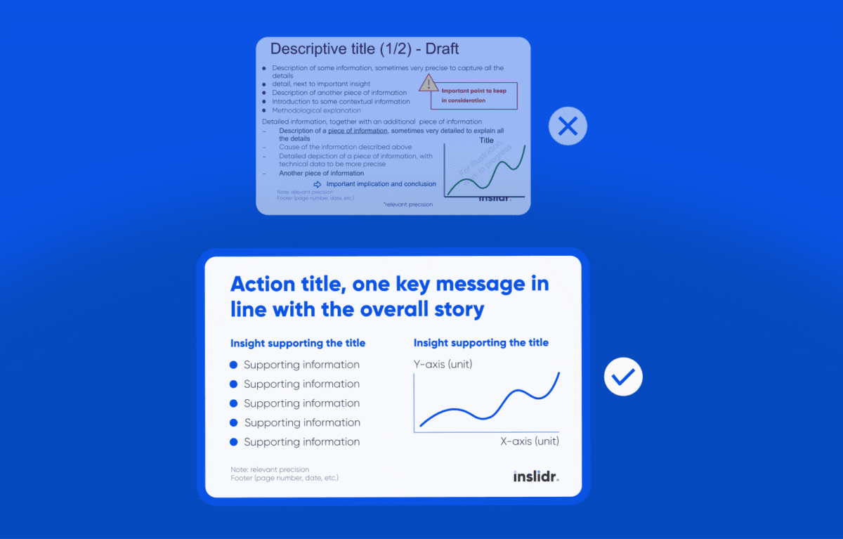
- Is action-oriented, not descriptive. Slide titles often only summarize the type of information on the slide, such as “2024 results,” “Context overview,” or “Competitive benchmarking.” Instead, focus on the so what—the key message you want the reader to take away. For example: “In 2024, sales increased by +12%, driven by a 34% growth in segment X.”
- Is precise. Whenever possible, include numbers and avoid vague adjectives or generic statements. Strive for objectivity.
- Fits within a maximum of two lines.
If required, adjust your storyline if you see that some items don’t follow those criteria.
inslidr tip – Flip through the titles
At any time in the slide building process, you can flip through your deck and read only the titles. They should tell the same story as your executive summary.
In the case of a long presentation, some slides will probably serve as deep dives and their titles won’t necessarily appear as executive summary items. Indeed, the executive summary must stay high level. This is fine as long as the title of each detailed slide supports one of the executive summary item.
You can start thinking about the content you will add in the slide bodies, but it’s not mandatory.
At this stage, you don’t need to build the slide bodies yet. There is one case in which this can be helpful: if you have not yet finished your analysis / research phase.
Indeed, many consultants begin writing their story before finalizing or even starting their research and analyses. This approach requires working with hypotheses, testing them, and refining the storyline based on the research outcomes. If you take this route, you can also start outlining in the slide bodies the data points or analyses which will be expected to support the slide title. This ensures you focus on useful analyses.
Complete the skeleton with structure slides.
Structure slides serve as guideposts throughout your presentation, helping your audience understand where they are in the story and what’s coming next. They make your presentation more organized and easier to follow. Structure slides can be designed creatively with inspirational visuals to enhance engagement and clarity.
There are different types of structure slides which can serve distinct purposes in your presentation.
Add an opening slide.
The first slide you see in a presentation is the opening slide. It sets the tone and introduces your presentation’s topic. It typically includes the company logo, presentation title, date, and the presenter’s name. Opening slides often feature a compelling visual.
Include an agenda slide.
An agenda slide outlines the presentation’s main sections and flow, helping the audience understand the structure upfront. It’s beneficial to keep the agenda clear and succinct, avoiding too many sub-points.
Integrate divider slides.
Divider slides signal transitions between major sections, reinforcing the overall structure of the presentation. These slides help reset the audience’s attention and can include visuals, section titles, or short summaries to preview the upcoming content. The dividers can also simply include the agenda.
Remember the thank you slide.
A thank you slide concludes the presentation professionally. It can be a simple thank you slide. It can also include a closing remark, a call to action, or contact details for follow-up. You should include it between the main presentation and the backup slides.
Provide back-up slides / appendices.
Back-up slides contain supporting information and additional details that may not be essential to the main flow but can be referenced during Q&A. These slides can include data tables, research details, methodology explanations, or alternative scenarios. It’s best to keep them well-organized so you can quickly navigate to them when needed.
💡
Skeleton example (EcoHome)
Let’s take the EcoHome example which we created to illustrate our storylining complete guide. EcoHome is a leading company in eco-friendly home products.
Below is a simplified (some details removed for the sake of simplicity) version of the executive summary.
EcoHome has experienced steady success over the past 10 years.
Competition has intensified and profits began to decline since last year.
EcoHome must innovate and shift to direct-to-consumer sales.
- Current products are outdated.
- Consumers now prefer smart home technology.
- Direct-to-consumer sales increase profitability.
A good skeleton must contain an executive summary, a storyboard (blank slides with titles) and structure slides.
Below is an example of what a good skeleton could look like for EcoHome. Use the slider to see the entire skeleton.


2. Build slide bodies.
At this point you will have your full horizontal flow and structure slides. As you can see, this approach significantly reduces the chances of getting lost in building or including slides that are not essential to your presentation. It’s now time to focus on building the slide bodies.
Integrate your insights, under the form of relevant visual elements (text, charts, diagrams, etc.).
On a slide, information can be presented in various forms: text, charts, tables, diagrams, etc.. The choice of elements depends on the type of information you want to convey, as outlined below.
If you’re unsure where to start, don’t hesitate to experiment. You’ll quickly see what works and what doesn’t. Put yourself in your audience’s shoes and ask: Is this easy to understand? If not, try a different approach. Over time, you’ll develop an intuitive sense for effective slide design, allowing you to create better slides with less effort.
In the meantime, here are some guidelines you can use.
Use structured text to communicate qualitative insights.
- Qualitative insights summarize analyses, which can be based on claims and evidence from reports, experts, focus groups, etc. They provide logical, narrative-driven conclusions.
- Examples include industry trends, executive summaries, and recommendations.
- For these, structured text is often the best choice. Enhance clarity and engagement by incorporating icons and pictures to visually emphasize key points.
Choose charts to highlight quantitative analyses.
- Quantitative insights focus on comparing data points across dimensions like time, size, or correlation.
- Examples include demand forecasts, supplier rankings, and market shares.
- For these, charts are the most effective visual tool. The type of chart you choose will depend on the comparison you’re making.
Add diagrams to explain processes and frameworks.
- Process and framework slides visually explain how something works.
- Examples include project timelines, team structures, or workflow overviews.
- For these, diagrams are ideal. Common types include flowcharts, process diagrams, and organizational charts, which help break down complex concepts into clear, digestible visuals.

Reuse, with caution.
As mentioned in step 1, reusing templates is a best practice. It is true at the overall slide master level, as a foundational step, but it’s also true at the slide body level.
At this stage, you can consider reusing content from other presentations, if you have off-the-shelf analyses on the current topic. However, make sure that any content you include clearly supports the storyboard. If it doesn’t, leave it out.
In terms of visual elements, try to think about similar designs you have already built. If a particular framework or specific diagram has already been created to illustrate a certain type of information, don’t reinvent the wheel: reuse it and fine tune for the new use.
Develop the habit of consolidating your best designs in one slide deck for potential future reuse. Over time, you’ll have a library of impactful slide designs, allowing you to pick, adapt, and apply them to your presentations.
Focus on what matters.
If you are running out of space, don’t move your titles or reduce your font sizes. If you need more space, you’re likely facing one of these scenarios: your slide has too many messages, your sentences are too wordy, or you’re going too much into details. To avoid those pitfalls, make sure to streamline your content:
Tackle one message per slide.
Remember, each slide should convey one clear message that aligns with your storyline. Therefore, avoid including insights that don’t directly support the slide’s title. If you realize you’ve missed relevant messages, remove them from the current slide, update your storyline, and create new slides—each with a single, focused message.
Simplify your wording.
Be concise and sharp. Eliminate unnecessary words, simplify sentences, and avoid buzzwords. Focus on delivering the core message clearly and effectively. Only write on your slide what is necessary to make your point.
Keep just the minimum required level of detail.
Ask yourself: Is this level of detail necessary? The amount of detail required depends on the presentation’s purpose (e.g., pre-read vs. live) and the audience (e.g., senior management vs. middle management). If the details are not required, just remove them. If the details are essential, break your content into multiple slides. However, avoid simply splitting the slide into parts labeled “(1/3)” or “(2/3).” Instead, start with a summary slide to provide the big picture, then use subsequent slides to deep-dive into specific areas, each supported by a clear key message.
Show the way.
Group your findings.
Group related ideas together to enhance clarity. Identify common themes, break down complex arguments into smaller parts, or organize data into meaningful categories. Clear grouping helps your audience process information quickly and effortlessly.
For text findings, you can use bullet points within each group. They break information into digestible, scannable chunks, improving readability and emphasizing key points. Keep bullet points concise—avoid full sentences and focus on delivering the essence of your message.
Draw attention with contrast.
The key to drawing attention is to introduce some contrast. Use bold text, bigger fonts and color selectively to highlight critical points. For instance, bold can emphasize key words, while color can differentiate categories or signal importance. However, use these tools sparingly to avoid visual clutter too much bold or too many colors can be distracting rather than helpful.
inslidr tip – tone down the 80%
To facilitate the introduction of vibrant colors or bold characters while avoiding visual overload, take the habit of toning down the majority of your design elements
- Avoid animations, or banners, they can dilute your message and make slides harder to read.
- Avoid decorative fonts, like Comic Sans. Choose fonts that are easy to read and professional, such as Arial, Helvetica, or Helvetica Neue.
- Use most of the time the thin version of the font if available (like Helvetica Neue Light)
- Use shades of grey for your text instead of full black
- Apply pastel colors to most your design elements
Add a navigator in long presentations.
If your presentation is long, include a navigation element such as a small agenda tracker or section markers. This helps your audience know where they are in the presentation and keeps them oriented, especially in complex discussions.
Be rigorous and precise.
Precision builds credibility. Every number, label, and reference should be accurate and well-documented to avoid confusion or misinterpretation.
Check spelling.
Typos and spelling mistakes instantly reduce credibility. Run a spell check, but also manually proofread to catch context-based errors that automated tools might miss.
Check that numbers add up.
Ensure all calculations, totals, percentages, and references to data are correct. Even small numerical errors can undermine your credibility and lead to confusion.
Include legends and labels.
Charts, graphs, and tables should always have clear legends and labels. Avoid ambiguous abbreviations or acronyms without explanation. If additional context is needed, a brief note can clarify key points.
Add footnotes.
Whenever you present data, quotes, or external references, cite your source in the footnote section. This enhances credibility and allows your audience to verify the information if needed.
Remove double spaces.
This one is kind of next level. Extra spaces between words or after punctuation marks can make text look uneven and unpolished. Objectively, only a few people will even notice the issue, but a quick find-and-replace can help eliminate unnecessary double spaces for a cleaner appearance.
Make it look good.
Align everything.
Alignment makes a huge difference. Make sure that your related elements are aligned together. Start by ensuring every visual, text box, or chart shares a consistent edge or centerline. For example, align the top edges of charts, icons, or images in a row
Stick to one style per group. This will create a clean line that guides the eye naturally. For example, don’t center-align a title above a left-aligned chart.
Most presentation tools, like PowerPoint or Google Slides, simplify alignment with built-in features. Select multiple elements and use Align Left/Center/Right/Top/Bottom. Enable gridlines to create an invisible guide for consistent spacing and positioning.
inslidr tip – adjust paddings and spacings
Set all paddings to 0, line spacing to 1, and remove automatic spaces before and after paragraphs. This will make your life easier to align the visual elements of your slide and make everything fit on one slide.
Use white space.
White space (or negative space) improves readability and helps structure information visually. Avoid overcrowding your slides allow breathing room between elements to enhance clarity. A well-spaced slide is easier to read and more visually appealing.
The best example of white space best practice is the invisible box (inslidr wording). It refers to maintaining a clean margin around the edges of your slide, imagine being restricted by a box inside your slide, and you can’t write outside this box (except for headers and footers).

Write big enough.
Your text should remain legible without requiring a giant screen. Use a minimum font size of 8, but aim for 10 or larger for optimal readability. Reserve smaller sizes for footnotes, headers, or footers if necessary.
Remove « orphan » words.
Orphan words are single words left alone on a new line, making the slide look unbalanced. Adjust spacing, reword sentences, to ensure smoother formatting.
3. Check consistency in design throughout your presentation.
At this stage, you’ve built each slide. Most of the heavy lifting is done, especially if you’ve used the Slide Master, but one of the most impactful improvements remains: ensuring consistency in layout across all slides. This step will significantly enhance the overall professionalism of your presentation.
Check that titles are aligned across slides, and ensure headers, footers, and the company logo are also aligned. Then, review font types, colors, spacing, margins, and other design elements. While these details may seem minor, together they create a polished and cohesive presentation.
Take title alignment, for example. It’s easy to overlook, but even slight shifts in title positioning can become noticeable and distracting when flipping through the deck. Imagine reading a book where every page has different margins. Consistently aligned titles instantly elevate the perceived quality of your presentation. In fact, this is one of the first pieces of advice I give when reviewing slide decks—it’s simple to fix yet has a dramatic impact on how your work is perceived.
💡
Zoom on CRAP
This notion of consistency is called repetition in UI/UX design theory; it is one of the four core design principles of the CRAP framework.
The CRAP framework was developed by Robin Patricia Williams. It’s a simple way to remember key design principles that make visual materials clear and effective. Aside from repetition, we’ve actually already touched on the other three elements in this article.
- Contrast: make different things look different
- Repetition: repeat visual elements and design choices
- Alignment: make sure every connected element are aligned
- Proximity: group related items together, keep unrelated ones apart
4. Iterate and refine your slides.
Like storylining, slide writing is an iterative process don’t expect to get it perfect on the first try.
Ask for Feedback.
Seek feedback from colleagues or peers to uncover areas for improvement. Fresh perspectives can offer valuable insights that you might have overlooked. Use their input to refine your slides and elevate the overall quality of your presentation.
Leave your slide alone and come back to it.
In addition to seeking external feedback, another tactic I would recommend is stepping away from your slides periodically. When working on visual design, it’s easy to lose perspective after spending too much time on it. Taking a break helps reset your perception, allowing you to return with fresh eyes. This is a trick I learned in photography postproduction, and it works just as well for slide design.
Use our checklist to check you have followed all steps.
You are still unsure your slides are well-designed? Use our checklist below.

Conclusion.
You don’t need to be an artist to master slide writing. Creativity is always a bonus, but what you do need is a structured approach.
- Draft a skeleton – the foundations. Optional: setup the Slide Master, use a slide library. Start with the executive summary, built from your storyline. Build the storyboard / ghost deck. Add structure slides.
- Build slide bodies – the vertical flow supporting your messages. Reuse. Choose relevant visual elements. Be precise. Streamline, less is more. Group your findings. Use white space. Align. Write big enough. Draw attention with contrast. Avoid distractions. Add a navigator. Take care of the final details.
- Check consistency – make sure that your design choices are consistent throughout your presentation.
- Iterate – slide writing takes practice, try and retry. Ask for feedback. Leave your slide alone and come back to it.
By following this four-step method, you will be able to create professional, impactful presentations efficiently.
You want to take a shortcut? Get the toolkit, our slide library built on consulting best practices.
What’s your biggest challenge when it comes to slide writing? Do you find these tips helpful? Have you discovered any technique that works particularly well for you? Share your thoughts in the comments below!
If you found this guide useful, share it with friends and colleagues who might benefit.
Happy slide writing!
If you liked the post, share it with your friends!
Skip blank slides.
Take the same shortcut consultants do.
Related posts.

How consultants tell stories: the complete storylining guide
Learn how to outline a presentation with our consulting storylining method. Craft an executive summary, formalizing ideas in a logical flow.
How consultants design slides: the complete slide writing guide for powerful business presentations
Learn how consultants design slides in 4 simple steps. Use our slide writing method to create powerful, persuasive business presentations.
Consultants care about slide layout, and you should too
Learn why consultants care so much about slide layout while it’s overlooked by most other professionals.


Leave a Reply